BYE THE BLUETOOTH EAREPHONE LINK 👉🏻 buy this earephone Also visit my store👉🏻 https://amzn.to/3jnXio8 Samsung Galaxy M42 5G (Prism Dot Black, 8GB RAM, 128GB Storage) 👉🏻 https://amzn.to/3ymO5jW Studd Halmets https://amzn.to/3sTTxcY Boya m1 mic = https://amzn.to/38F5qu5 Bluethooth boat 210 https://amzn.to/2ZfvlHp Cap https://amzn.to/3EvQMnA Sport shoe https://amzn.to/3kE3zwk
HERE IS ANIMATED LOGIN FORM SOURCE CODE

COPY THIS HTML AND CSS CODE
<!DOCTYPE html>
<html lang="en">
<head>
<meta charset="UTF-8">
<title>Document</title>
</head>
<body>
<html>
<head>
<title>Animated login form</title>
<link rel="stylesheet" href="style.css">
</head>
<body>
<section>
<form class="box" action="index.html"
method="post">
<h1>login</h1>
<input type="text" name=""
placeholder="username">
<input type="password"
name="" placeholder="password">
<input type="submit"
name="" value="login">
</form>
</section>
</body>
<style>
body {
margin: 0;
padding: 0;
font-family: sans-serif;
background: #34495e;
}
.box h1 {
font-style: italic;
color: white;
text-transform: uppercase;
font-weight: 500;
}
.box input[type="text"],
.box input[type="password"] {
border: 0;
background: none;
display: block;
/*background effect is
not put when we do block*/
margin: 20px auto;
text-align: center;
border: 3px solid #3498db;
padding: 14px 10px;
width: 200px;
outline: none;
color: white;
border-radius: 27px;
transition: 0.25s;
}
.box input[type="text"]:focus,
.box input[type="password"]:focus {
width: 280px;
border-color: #2ecc71;
}
.box input[type="submit"] {
border: 0;
background: none;
display: block;
margin: 20px auto;
text-align: center;
border: 3px solid #2ecc71;
padding: 14px 40px;
cursor: pointer;
outline: none;
color: white;
border-radius: 24px;
transition: 0.25s;
}
.box input[type="submit"]:hover {
background: #2ecc71;
}
input::placeholder
{
color: #fff;
}
.box {
width: 300px;
padding: 40px;
position: absolute;
/*to make center
position of element*/
top: 50%;
left: 50%;
transform: translate(-50%, -50%);
background: rgba(0, 0, 0, .1);
text-align: center;
/* border-radius: 100%;*/
animation: avi2 2s infinite;
}
section {
width: 100%;
height: 100vh;
color: #fff;
background: linear-gradient
(-45deg, #EE7752, #E73C7E, #23A6D5, #23D5AB);
background-size: 400% 400%;
position: relative;
animation: move 2s infinite;
}
@keyframes move {
0% {
background-position: 0 50%;
}
50% {
background-position: 100% 50%;
}
100% {
background-position: 0 50%;
}
}
@keyframes avi2 {
0% {
border-radius: 0%
}
50% {
border-style: dotted
}
100% {
border-radius: 50%
}
}
</style>
</html>
THANK YOU HAVE A GOOD CODING JOURNEY ❤
Popular posts from this blog
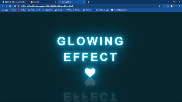
HERE IS GLOWING EFFECT TEXT USING HTML, CSS 1- COPY THIS HTML CSS CODE <!DOCTYPE html> <html lang="en"> <head> <meta charset="UTF-8"> <title>GlowingEffects</title> </head> <body> <h2 contenteditable="true" class="avi">abhi+shek</h2> </body> </html> <style> *{ margin: 0; padding: 0; box-sizing: border-box; font-family: arial; } body{ display: flex; justify-content: center; align-items: center; min-height: 100vh; background: #07252d; } h...

HELLO HERE IS 3D LAYER SOCIAL ICONS SOURCE CODE YOU MUST HAVE INTERNET CONNECTION TO RUN THIS PROJECT ! 1-COPY THIS HTML CSS CODE <html> <head> <title>CSS SOCIAL MEDIA ICON HOVER EFFECTS</title> <link rel="stylesheet" type="text/css" href="style.css"> <link href="https://stackpath.bootstrapcdn.com/ font-awesome/4.7.0/css/font-awesome.min.css" rel="stylesheet"> </head> <body> <ul> <li> <a href="#"> <span></span> <span></span> <span></span> <span></span> ...
Comments
Post a Comment